Picture this: You've poured your heart (and budget) into a sleek new website. It looks stunning on your desktop. The colors pop, the animations are smooth, and you're ready to show it off to the world. Then someone pulls it up on their phone and… it's a disaster. Buttons overlap, text spills off the screen, and your carefully crafted menu is nowhere to be found.
Welcome to 2026, where more than half of your potential customers are browsing on mobile devices, and a non-responsive website isn't just inconvenient, it's basically handing your competitors a gift-wrapped opportunity to steal your audience.
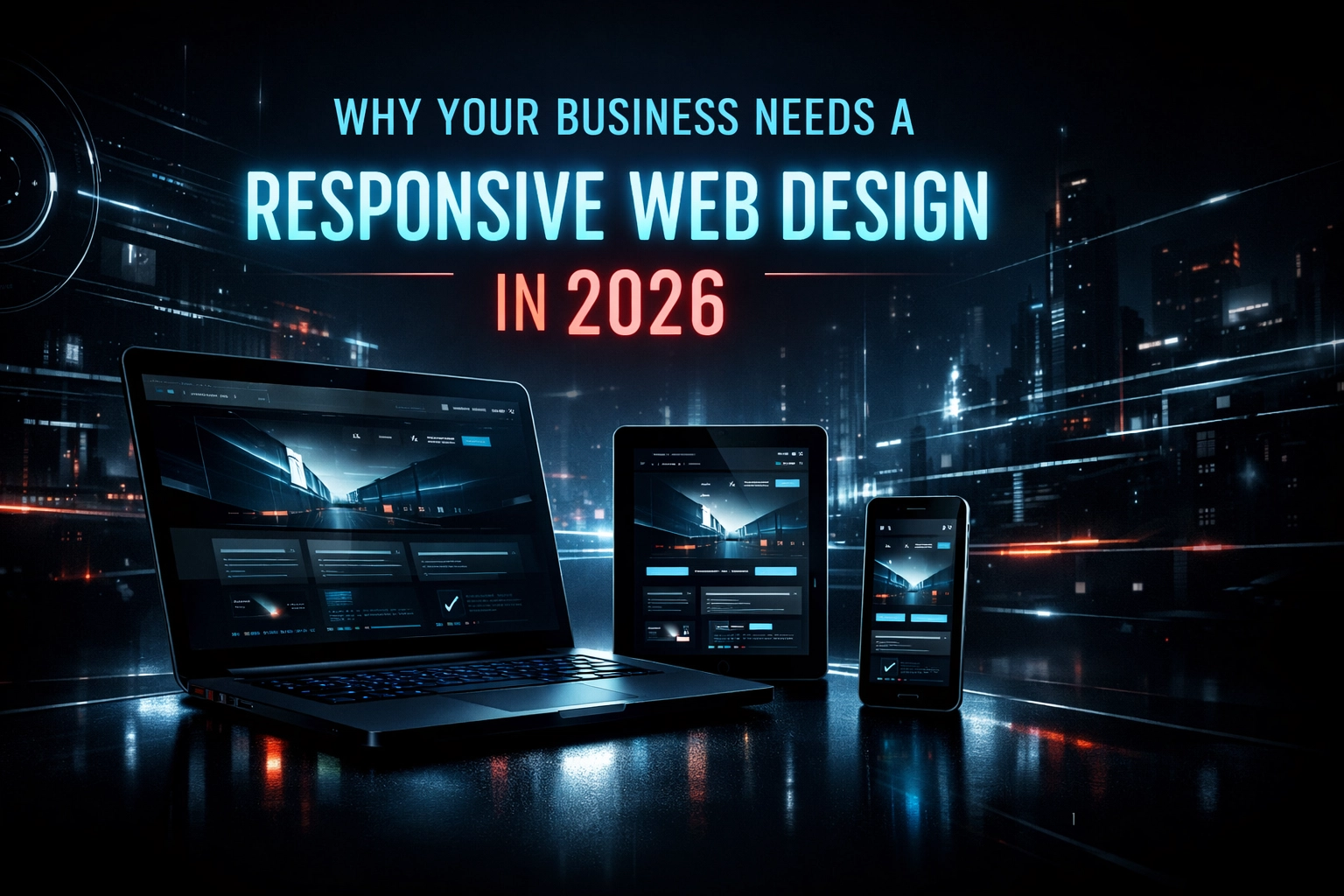
If you're a Dubai business still clinging to a desktop-only design (or worse, a separate mobile site that feels like it time-traveled from 2010), we need to talk. Responsive web design isn't just a nice-to-have anymore. It's the difference between thriving online and being invisible.
Your Customers Are on Their Phones (And Google Knows It)
Let's start with the elephant in the room: mobile traffic now accounts for over half of all global web usage. Think about your own browsing habits for a second. When was the last time you waited until you got home to look something up? You're checking restaurant menus while stuck in Dubai traffic, comparing prices while waiting for your coffee, and scrolling through services during your lunch break.
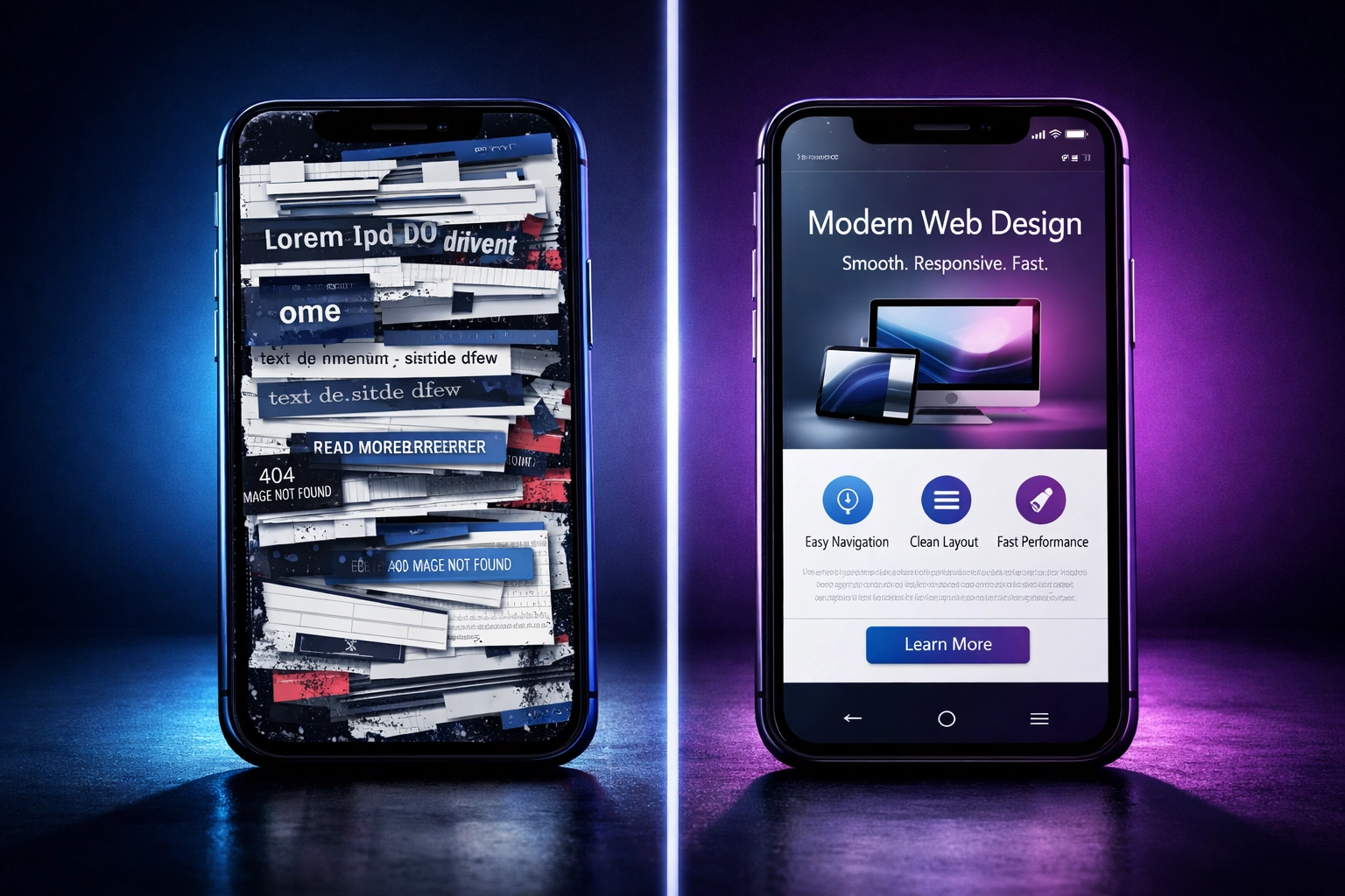
Your customers are doing the same thing. And if your website doesn't load properly on their smartphone, they're not going to squint and struggle, they're going to bounce straight to your competitor's mobile-friendly site.
Here's where it gets even more interesting: Google's mobile-first indexing means the search engine giant now uses the mobile version of your website as the primary version for ranking purposes. Translation? If your site isn't optimized for mobile, you're actively sabotaging your SEO efforts, no matter how much keyword research you've done.
User Experience Isn't Just a Buzzword, It's Your Bottom Line
You've probably heard "user experience" thrown around in every marketing meeting, but let's talk about what it actually means for your business. When someone lands on your website, they're making a split-second judgment. Is this site worth their time? Can they find what they need without frustration?
Responsive web design ensures that whether your visitor is on a massive desktop monitor or a compact smartphone, they can navigate your site effortlessly. Menus stay accessible. Buttons remain clickable. Forms don't require microscopic precision to fill out. It's the digital equivalent of holding the door open for your customers instead of making them struggle through a revolving door that's spinning too fast.
And the data backs this up: websites that load within a single second can achieve conversion rates up to three times higher than sites that take around five seconds. That's not a small difference, that's the gap between a thriving online presence and watching potential customers disappear before they even see what you offer.

When your UI UX design services prioritize responsiveness, you're not just making things look pretty. You're removing friction from the customer journey. Every smooth interaction, every intuitive button placement, every perfectly scaled image builds trust and keeps visitors engaged.
The SEO Advantage You Can't Afford to Ignore
Let's get tactical for a moment. Google's algorithm doesn't care about excuses. It cares about delivering the best possible results to users. And since most users are on mobile devices, Google has made responsive design a ranking factor.
Here's what happens when you invest in proper responsive web design: you maintain one unique URL for your website, regardless of the device accessing it. This simplifies Google's indexing process and consolidates your SEO authority instead of splitting it across multiple versions of your site.
Think of it this way, if you're running separate desktop and mobile sites, you're essentially competing against yourself for search rankings. Your link-building efforts get divided. Your content authority gets fragmented. It's like trying to fill two buckets with one hose when you could just use one bucket and fill it twice as fast.
A web development agency in Dubai that understands responsive design will build your site with a unified approach that makes Google's job easier, and when you make Google happy, your search rankings improve. More visibility means more traffic, which means more opportunities to convert visitors into customers.
Future-Proofing Your Digital Presence
Technology doesn't stand still. Remember when tablets were the hot new thing? Now we've got foldable phones, smart watches with browsers, and who knows what's coming next. (Honestly, at this rate, we'll probably be browsing websites on our refrigerators, oh wait, some people already do that.)

This is where custom website development truly shines. Responsive design uses flexible grids, fluid images, and intelligent code that automatically adapts to any screen size or device type. Your website becomes device-agnostic, ready for whatever new technology hits the market without requiring a complete overhaul every time Apple releases a new phone.
It's the difference between building a house with solid foundations that can be renovated versus constructing something so specific that it needs to be torn down and rebuilt every few years. Which one sounds like a smarter investment?
The Hidden Cost Savings Nobody Talks About
Here's something that might surprise you: responsive web design actually saves you money in the long run. Yes, the initial investment in proper custom website development might be higher than slapping together a basic template, but let's break down the math.
With a responsive site, you're maintaining one codebase, not multiple versions for different devices. Every update you make happens once and propagates across all screen sizes. Your hosting costs stay streamlined. Your testing process becomes more efficient. And when you inevitably need to add new features or refresh your content, you're working with a single, cohesive system.
Compare that to juggling separate mobile and desktop sites, double the maintenance, double the testing, double the headaches, and definitely double the bills from your development team.
How Tadween Space Approaches Responsive Design
Now, you might be thinking: "Okay, I'm convinced. But how do I actually get this done right?" This is where the template trap catches a lot of businesses. They grab a pre-built theme, tweak a few colors, and call it a day. And sure, it might technically be "responsive," but it's also generic, limited, and probably looks eerily similar to a dozen other websites in your industry.
At Tadween Space, we take a different approach. Our custom website development process starts with understanding your specific business needs, your target audience, and how people actually interact with your brand online. We're not just making things fit on smaller screens: we're crafting experiences that work beautifully regardless of how someone finds you.

Our UI UX design services go beyond the basics of responsive layouts. We think about touch targets for mobile users (because thumbs need bigger buttons than mouse cursors). We optimize image loading to keep your site fast even on spotty mobile connections (crucial in Dubai's high-rises where signals can get wonky). We test on actual devices, not just browser resize tools, because real-world performance matters more than theory.
Every project at Tadween Space starts with a mobile-first mindset. We design for the smallest screen first, then enhance the experience as more screen real estate becomes available. This approach ensures that your core message and functionality never get lost, regardless of device constraints.
And here's the thing about working with a web development agency in Dubai that truly gets it: we understand the local market. We know that your customers are tech-savvy, expect premium experiences, and have zero patience for clunky websites. We build with those expectations in mind.
The Bottom Line for Dubai Businesses
Let's bring this home. It's 2026, and the digital landscape has evolved past the point where responsive web design is optional. Your competitors are already investing in mobile-optimized experiences. Your customers expect seamless interactions across all their devices. And Google is actively rewarding websites that deliver on both fronts.
The question isn't whether your business needs responsive web design: it's whether you can afford to delay any longer while your competitors capture the mobile-first audience.
If you're ready to stop losing customers to poor mobile experiences, let's talk. Tadween Space specializes in creating responsive, user-friendly websites that don't just look good: they drive real business results. Because in a world where everyone's browsing on the go, your website needs to go with them.
Your business deserves a digital presence that works as hard as you do, on every device, every time. That's not just good design; it's smart business strategy for 2026 and beyond.
Leave a Reply